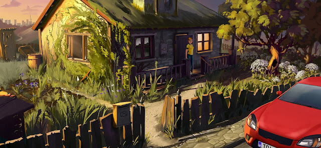
The demo in question is Crowns and Pawns: Kingdom of Deceit, a point&click adventure claiming to model itself on the classics. From what I've seen so far it doesn't seem an unreasonable claim but I do have a few reservations before I climb on board the bandwagon.
My main reason for holding back lies with the nature of the demo as a demo. It's exceptionally professionally produced, as slick as whatever unsavory simile for slickness you care to employ, but I'm not sure it told me nearly as much about the game as I felt I needed to know.
It's certainly one of the most commercially-minded demos I've ever played.
Excised from the screenshot at the top of the post are the "Wishlist Now" and "Subscribe" buttons that appear at the bottom left and right of
the screen respectively. They were in my line of vision for pretty much the
entire time I was playing..
I acknowledge the clear-sightedness of the marketing department in making sure no-one's allowed to forget why the demo exists but their single-mindedness had exactly the opposite effect on me. I did not add the game to my wishlist, pretty much out of spite.
Chances are I will, sometime. It looks enough like a game I would enjoy playing for me to want to keep an eye on it. It's hard to be sure, though, because whoever designed the demo made a conscious decision to focus on one aspect of the game over all the rest.
The Crowns and Pawns' Steam page has a list of features that includes "a blend of history and myths set in a modern world, featuring real life locations all around Europe" but the demo takes place in a run-down, two-room cottage. The game also features "fully voiced dialogue" and "interesting dialogue choices" but the demo begins with a statement warning you won't be experiencing much of that in the chapter they've chosen to show.
What you most definitely will be doing is solving puzzles. When they tell you to expect "Classic point-and-click puzzles that involve finding items [and] creatively combining the contents of your inventory" they really aren't kidding. That's all you'll be doing!
It's also the first thing you'll be doing. Well, alright, strictly speaking the first thing you'll be doing is arriving in your rented car, walking up the path, finding the door to the cottage already open and stepping inside... only to find it's pitch dark and the lights don't work.
The solution...
This is going to be a spoiler by the way...
I'm warning you now so you can turn around and leave if you want to play this thing and work out all the puzzles for yourself...
Everyone good now?
Okay, the solution to the first problem isn't hard to spot. Right next to the front door there's a fusebox. In your inventory there's a bunch of keys. Open the box with the keys. So far, so extremely easy. Not so the next part, which did give me a little trouble. You have to move some dials around to meet a particularly unlikely set of conditions. I've fiddled with a fair few fuseboxes in my time and I've never seen one with rules like these.
The demo has been pulled straight from the game itself, where it's known as "Chapter Two." I'm guessing you won't be tasked with a logic puzzle within thirty seconds of logging in when the real thing arrives. I imagine there's a warm-up before you need to exercise your puzzling muscles in earnest. I know I could have used one.
The puzzle wasn't too tough, fortunately, or this would have been a much
shorter and even snarkier review. It took me a few goes but eventually I had
that "D'oh" moment so familiar to adventure gamers. As I was to realize
several times during the hour or so I spent playing the demo, the difficulty
of the puzzles wasn't going to be the problem. The nature of them was.
Adventure games have a few generic flaws, the most annoying of which are the aforementioned arbitrary win conditions, a blunt refusal to allow actions that are irrefutably reasonable and a corresponding insistence on irrational, usually convoluted, alternatives. Crowns and Pawns is definitely in line of descent from the classics as far as all of those are part of the tradition.
Let's just stick with that fuse box for now. If you entered a small cottage on a blindingly sunny day, would you expect to need to switch the lights on before you could see more than a foot in front of your face? Does sunlight not go through glass in this version of Europe?
Come on, now. That's harsh. Surely there's a logical explanation? The cottage
belonged to the protagonist's grandfather, who just recently died. Maybe there
are blackout curtains at the windows. The shutters might be closed out of
respect.
No, they are not. Neither of those things nor anything like them is true and you can be sure of that because you can see from the outside of the house that there are no shutters or curtains, something immediately confirmed from the inside, when you do switch on the light.
Why the room is in total darkness defies not only logic but physics, as does the view from inside the room. As the screenshot below shows, from inside the cottage the sunny day seems to have vanished, replaced by utter blackness outside both the open door and window, even though, in the next room, as shown in the scene above, the artists have made a particular point of showing how brightly-lit that room is by the sunlight streaming in.
A game that prides itself on having both "beautiful hand painted art that comes to life with a touch of modern graphics" and "a world that reacts to your decisions" ought to work a little harder to feel like an actual place, rather than a stage set. There are several other occasions when a simple, straightforward solution to a problem is denied, sometimes by the game just not offering any such possibility but more frequently and far more annoyingly by a scripted response giving a spurious and wholly unconvincing explanation as to why it can't be done.
None of this bothers me all that much. If it did I'd have stopped playing
adventure games years ago. Even the very best of them are stuffed with moments
like this. I do think, however, that it's a bad idea to have quite so many of
them displayed quite so prominently in a demo. I guess you could credit the
developers for exceptional honesty but the effect it had on me was mostly to
make me question whether I could put up with it for a whole game.
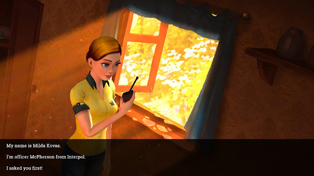
By the end, though, I figured that, yes, I probably could. It has a lot going for it. The graphics are attractive to look at. I think "beautiful" might be pushing it but "pretty", certainly. The voice acting is solid, although the demo doesn't offer a wealth of evidence in that direction. Apart from Milda, the protagonist, (who talks to herself a lot and sounds uncannily similar to several other young, female protagonists in other adventure games I've played. Maybe they're played by the same actor...) there's only one other character, a disembodied voice on a walkie-talkie that someone throws through a window early on in the demo. A closed window.
The plot is interesting enough that I want to find out what happens next and Milda is a likeable-enough lead. The puzzles, despite my sarcasm, are probably less egregiously illogical than average and they're pitched about right for me in terms of difficulty. I would definitely download Crowns and Pawns if it turned up for free on Amazon Games or Epic or somewhere like that and I'd probably play it, too.
I'm not sure I'd pay money for it, though. Everything about it does feel quite
bland. It's a bit like adventure gaming by numbers. The demo works very well
in convincing me the developers are fully capable of producing a good-looking,
fully-functional adventure game, although I am a little troubled to learn the
demo itself has been available in what appears to be identical form for at
least a year and a half.
What the demo doesn't do is get me itching to play the full thing right now. Does that make it a bad demo? Maybe
try it yourself
and see what you think. It took me less than an hour. Or watch one of the many playthroughs on
YouTube. I watched
this one. That doesn't ask for much more than half an hour of your time.
Or you could just watch the new trailer, which takes less than two minutes and yet manages to makes the whole thing look a lot more appealing. I guess that means it's a good trailer.
Two demos down, five to go.


Tried this one briefly. I'm out. I'm not a big point-and-click fan to begin with, and this one was not exciting. Even in a demo, having the character stare at the blank space where a held book would have been is… disconcerting. I got as far as where I would have had to get out a pencil and paper or a keyboard IRL to continue, and decided it wasn't worth it.
ReplyDeleteThanks for the pointer, though!
"I got as far as where I would have had to get out a pencil and paper..." If you mean the bit where you have to interpolate words from three sheets of paper, I thought that was a pencil and paper job too. I took screenshots of all three, opened them in Paint.net, pasted them all into one image... and then I realised the game actually does all that for you. You just have to drag each sheet over the next at the lamp and they meld into a single, readable copy. I don't think any games really expect you to get out a pencil and paper any more. You have to be old enough to remember when that was considered normal behavior to imagine it's needed these days. No-one else would even think of it.
DeleteYou're right about it not being exciting, though. Considering they're going for the Syberia/Broken Sword market, games which are both funny and exciting, they seem oddly convinced a static one location, one character demo is going to sell it for them. I suspect they'll be disappointed.
Lol, I only figured out how to "develop" two of the three sheets, so apparently the melding thing was not happening for me. Good to know that if you get all three it's auto: I had suspected something like that, but couldn't figure out anything.
DeleteI feel like a one-chapter demo like that should at least be feature-complete. Anyhow, was fun to give it a quick try.
Thank you for the article! It is always very useful to read honest critique!
ReplyDeleteRegarding a couple of points:
"Why the room is in total darkness defies not only logic but physics, as does the view from inside the room."
The answer is that it is not day, it is a late evening, and that dark room does have window (and door) only on the side that is not reachable by the sun. (SPOILER: you will have to revisit these locations at day as well.)
And regarding walkie-talkie – didn't you think the person that barred internal door and escaped through the window when you turned on the light could have dropped it?