MagiWasTaken has a post up called "Don't you ever run out of topics?". The answer is a very simple "No" although he still manages to get a couple of thousand words out of it.
He's on an unbroken posting streak going back four hundred and forty two days. Wilhelm mentioned recently that he's posted for seven hundred days straight. I'm waaaaay behind both of them on my current daily run, which stands as of today at two hundred and twenty seven days of posting without a break.
So, have I run out of topics? Or ideas? Or energy?
Nope! I have, however, run out of time to write anything of either significant length or meaningful content because yet again I spent the entire day playing Guild Wars 2. I got away with it yesterday because I just hammered out a quick precis of what I'd done and pretended there was some purpose to it.
I'd be perfectly willing to pull the same trick again if I thought I could get away with it but unfortunately (as far as the blog goes) I did almost exactly the same today as I did yesterday, minus the big meta event, which wasn't being done on the map I was on, or I would have done that, too. I think I'd be pushing my luck if I tried to spin another day spent peering at maps trying to find elusive points of interest, peppering golems with an arrow cart or sorting bags on four or five more characters into anything anyone would even pretend to find worth reading.
I could always fall back on what's become an old favorite (Of mine, that is.
Not of anyone else's, I'm sure.) and pretend this is my own pirate radio
station. (I suppose, with the internet being what it is, I could actually have
my own pirate radio station... there's a thought...) but that would make for
the third music post in just over a week, which seems a little much even to
me, especially since I also did a TV post the day before yesterday.
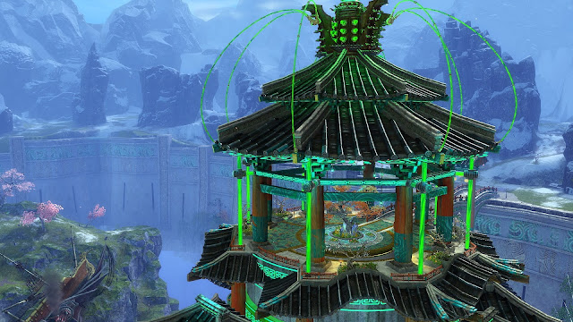
That leaves one obvious choice. It's quick, it's easy and it's all about mmorpgs so it's inarguably On Topic. Yes, it's time for a screenshot post!
And you know what, I've even thought of a peg to hang it on. Honestly, this isn't just a bunch of random snaps I took while I was playing!
Here's the thing. No matter how much I complain about ArenaNet and Guild Wars 2 at times, I have never been anything but highly complimentary about the art team. Every time I review any content drop, no matter how I moan about it being short or tedious or badly-written, I always end up saying something like this:
"The ANet art team knocked it out of the park again. We expect it but even by their standards this is gorgeous work."
That's what I said about End of Dragons in my first impressions post. At the time I believed it was an uncontroversial, indeed most likely an uncontested opinion.
I was wrong. I was looking for something on the official GW2 forum the other day when I came across several threads complaining about oversaturated colors. Someone (In a thread I now, of course, can't find.) even went so far as to claim that the graphics in the original game as it launched nearly ten years ago were significantly better than they are now - and they posted some very convincing evidence in the form of screenshots to prove it, too.
After that, I started looking at the Canthan maps with a more analytical eye
and I have to say I can see what people are complaining about. I hadn't really
noticed because I'm a huge fan of saturated color, as must be obvious from the
distorted images I churn out as headers for music posts here. If you're not, then yes, there's a problem.
Once you look closely at the scenery in the new maps, it does have a flatter, less detailed quality than the much older maps. The lighting effects are definitely not as realistic. And the colors are turned up well beyond eleven.
If you value naturalism and subtlety in your fantasy art, I guess the game hasn't necessarily been following the ideal trajectory all these years. The brush strokes have been getting broader, metaphorically speaking.
If it's spectacle and showmanship you're after, though, the whole shebang just keeps getting bigger and brighter. And louder. Where the art used to croon, now it shouts.
There are plenty of subtle touches if you look for them but it is more a case
of finding a quiet spot. Back in 2015 I was able to post
an elegy for Ascalon supported almost entirely by images of calm, reflective serenity. The colors
are muted autumnal browns, yellows and greys. Try something like that in
Cantha and you'd need to use filters. Or wear sunglasses.
Even though I don't necessarily agree with the players who find Cantha garish, brash and even badly rendered, it was instructive to be reminded of what the game used to look like. Something has changed and I hadn't even realised.
I'm not even sure whether I prefer the old art to the new. It is brasher but it arguably punches harder.
The nice thing is, I don't have to choose. Ascalon is still there whenever I want to go walking in the woods in the mellow afternoon sunshine but now I have a whole hyperactive meta-landscape to romp around, too.
And hey, I can get blog posts out of both of them, so I'm not complaining.


No comments:
Post a Comment